

|
January 8th 2026, Virtual |
|
| Chapter: | |
| Language: | English |
Presenters: |
||
| Jason L. Urquhart | ||
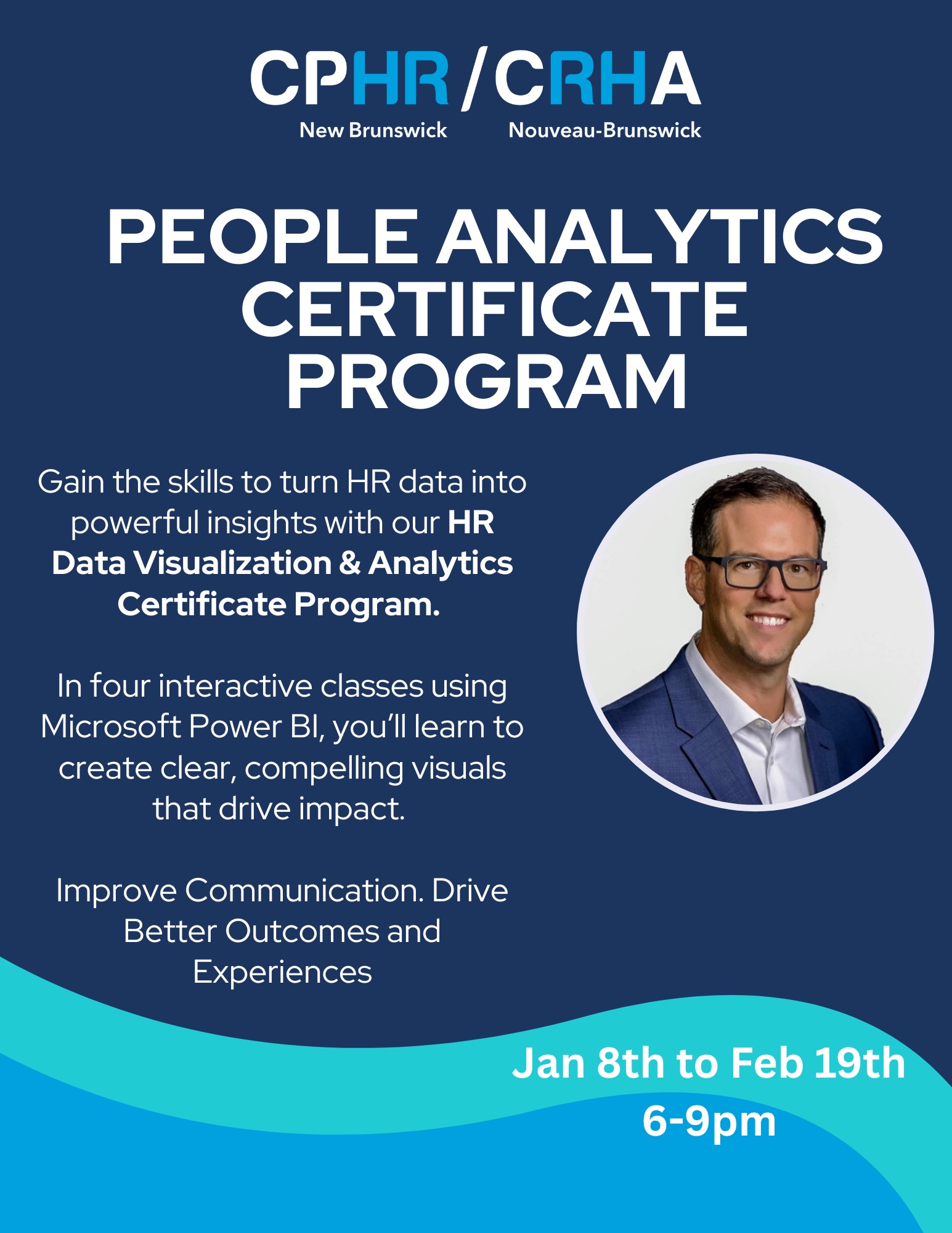
Jason L. Urquhart is a leading Canadian data practitioner and national consultant for human resources, insurance, finance, IT, and health professionals, integrating large datasets, to empower these organizations and their people to reach their goals and objectives through analytics & decision science. Jason is HUB International’s Advanced Analytics & Decision Science AVP and Chief Client Data Scientist for large national clients. He has more than 26 years of experience consulting in areas of analytics, data science, data privacy & security, innovation, digital & technology transformation, system design & optimization, safety metrics, certification & inspection, project & operations management, human capital management, and business development strategy. In addition, Jason is a co-founder of Data Science Practitioners East (an open mentoring network of practicing and aspiring data scientists), a member of the Python Software Foundation and an avid barista. Jason is also a contracted instructor at the University of New Brunswick MBA program in the Faculty of Management for Advanced Analytics & Data Science Strategy and Data Visualization courses, a guest lecturer, a speaker at AI/data science/technology events, and a regional judge at national data competitions. He resides in beautiful Fredericton, NB with his wife, two daughters, a scrappy maltase shiatzu and a heart-melting King Charles Cavalier Spaniel puppy. |
||
Description: |
||
Improve Communication. Drive Better Outcomes and Experiences. In today’s fast-paced Canadian workplace, HR professionals are under growing pressure to make confident, data-driven decisions. At the same time, they need to clearly communicate those decisions across the organization. Yet many still feel unsure about how to find the right data, interpret it effectively, and turn it into insights others can understand and act on. The HR Data Visualization & Analytics Certificate Program was designed to change that. Through hands-on, interactive training and use of Microsoft Power BI, you will learn how to translate complex HR data into clear, compelling visuals and stories that influence decisions and spark meaningful conversations. No technical background required. Over four classes, you will explore the principles of effective data visualization, develop practical storytelling design skills, and apply your learning through real-world HR-focused projects. This is designed for all HR professionals, from CHROs across the entire team. Whether you are new to analytics or looking to sharpen your skills, this program offers a supportive environment to build confidence, strengthen communication, and lead with insight. |
||
Special Notes: |
||
Program Overview Target Audience: HR Professionals Duration: Four Classes (3 Hours Each) Dates & Times: Class 1 - Thursday virtual - january 8th (6-9pm)
Class 2 - Thursday virtual - january 22 (6-9pm)
Class 3 - Thursday virtual - february 5 (6-9pm)
Class 4 - Thursday virtual - february 19 (6-9pm)
Class 1: Setting the Foundation (Virtual) Why Data Visualization & Analytics Matter
From History to Modern Practice
Core Principles of Effective Data Visualization
Choosing the Right Chart for the Right Story
Introduction to Power BI (Stage 1a: Functional)
Hands-On Practice
Class 2: Crafting Compelling Narratives (Virtual) Designing for Impact
Storytelling with Data
Creating Engaging Infographics
Dashboard Design Essentials
Power BI (Stage 1b: Functional Continuation)
Interactive Exercises
Class 3: Design Thinking & Application (Virtual) Power BI (Stage 2: Design Thinking)
Practicum Bootcamp
Project Practicum Pitch
Class 4: Showcasing Skills & Celebrating Success (Virtual) Practicum Presentations
Q&A and Expert Panel
Top Presenter Awards
Certificate Presentations
Key Program Features:
Requirements: All participants will be required to have a PC laptop with PowerBI Desktop installed. |